|

Join me on  and Watch me
on and Watch me
on 
Step by Step
Drawing Lesson #2
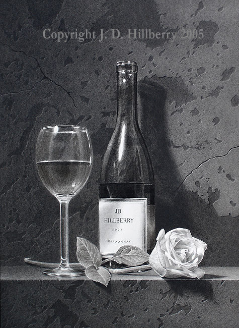
Title:
White Bouquet
Size: 18" x 14"
Medium: Charcoal, Graphite and Carbon on White
Paper
Step
One
To begin with,
I cut the subject shapes out of frisket and apply them to my
white paper. If
you are unfamiliar with this masking technique here's a
video that explains it:
After
applying the fiisket, I
begin applying layers of charcoal to the background and
blending with felt.

Step
Two:
Here I’ve begun adding texture to the background.
I start by lightening several large masses with a chamois.
This creates an area that appears to stick out from the
background. Then, I add to this effect by picking out
highlights on everything that is facing the light (upper
left corner of the texture). The lower right corner of
everything receives a cast shadow. There are small dark
spots that were created when I blended with felt. I use
these to make the holes by adding the highlights and
shadows.
The
left side of the background is close to being done. The
right side is still waiting for my texture enhancements.
I am including a close-up so you can see the texture more
clearly. Once I start drawing the objects, the background
can be toned down if it appears to busy. I won't know till I
get there!

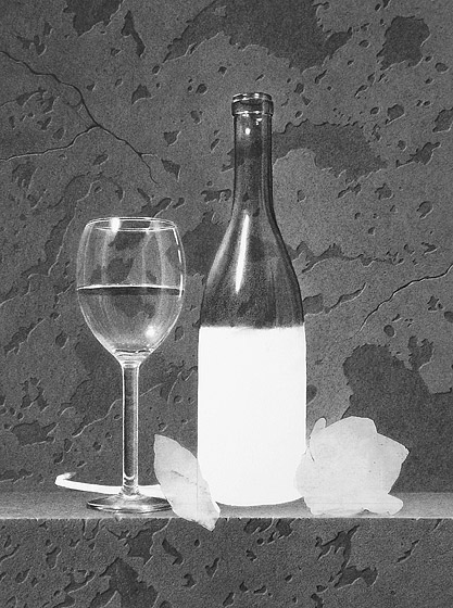
Step
Three:
At this stage I have
completed the basic values and texture of the background and
added the same type of texture for the front of the ledge. I
heightened the contrast to make the front pop forward from
the background.
I
have also sprayed it with
fixative, pealed the frisket from the glass and started
laying out the details of the wine glass. I cut out some
little pieces of frisket to mask the main highlights in the
glass. I could have used liquid frisket for this also.

Step
Four (a):
I've continued to enhance the background texture and started
on the glass by blending hb charcoal pencil with a stump and
a chamois. I masked the brightest highlights with
frisket.
All of the values are subject to change at this point. I
have to see how the values develop on the rest of the
elements in the drawing before I start to balance everything
out.

Step
Four (b):
Since I invented the background, I needed to know how much
of that texture would be visible through the glass and
bottle so I set up my drawing behind them and took some
photos. I've included one of those here.

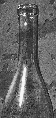
Step
Five:
I finished the glass (for now) and started on the bottle.
I'm using carbon for the bottle to help it stand out from
the charcoal background. I have included a close-up of
the bottle to show the texture that the carbon is creating.
While rendering the glass, I noticed that in order to get
the contrast I want; I will have to darken the background on
the left side. You will notice that the background is darker
peering through the glass. This wont be the case when I'm
done. I'm waiting until I'm closer to being finished to do
that to keep it from messing up my highlights. As I said
before, all the final value adjustments will be made after
all the elements are in.
Bottle close-up
Step
Six:
The wine bottle and label are done and I started
working in the leaves. I also darkened the background on the
left. to help the wine glass "pop" a little better.

Step
Seven:
The basics values are done on the rose head. I will have to
darken the basic values once the bottle's cast shadow is in
place directly behind the rose. That’s the last step and its
next!

Finish:
The final step involves
pumping up the contrasts as much as possible. I go over the
darkest areas again with charcoal. I have to be very careful
to keep my the white areas clean at this stage. I usually
put the drawing away for a few days and then come back for
these final adjustments.
My
goal is extreme realism. When you only have black, white,
and shades of gray to work with, you must make use of the
entire range of values that your media is capable of to make
that possible..
The composition as it
relates to values:
I want to explain a little
bit about my thought process behind the composition. I
always try to plan ahead in my work to make sure I can
maximize the available contrast. In other words, if I want
something to look white, it's much easier to place it
adjacent to something dark.
The flower head was deliberately placed in front of the cast
shadow of the bottle to make it appear whiter and to give me
a wider value range to work with when I rendered the petal
details.
The background is darker on the left to help make the glass
"pop" more. It also helps balance the dark values of the
cast shadows on the right.
NEW
Click below to check out my new VIDEO
TUTORIALS

|


